Coral Restoration Foundation
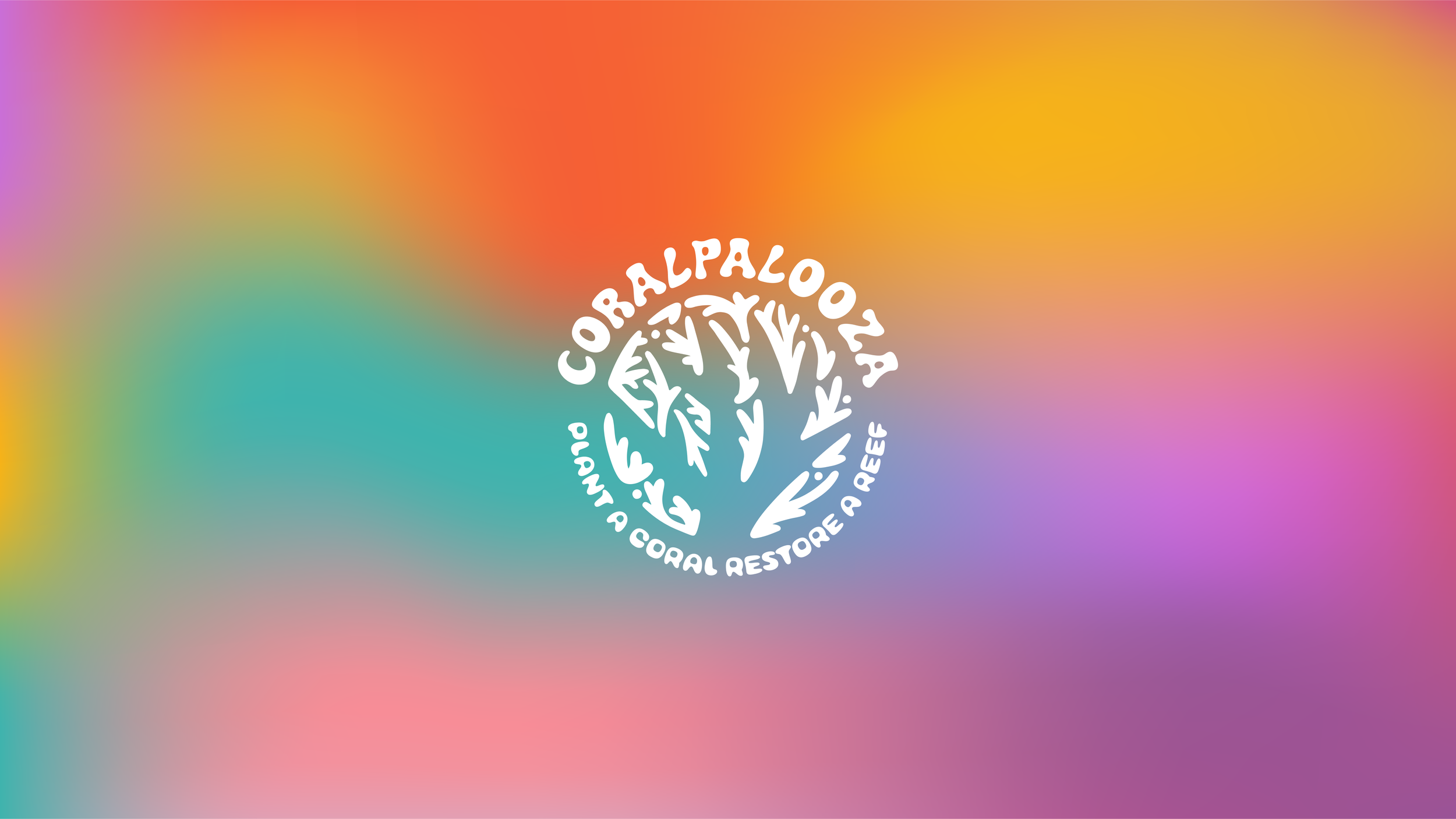
CORALPALOOZA REBRAND
The annual Coralpalooza event helps Coral Restoration Foundation reach outplanting goals & engage with the local community. It is a good-vibes only diving oriented celebration, so I wanted to create something that fit that feeling. I decided to create a branding package with a playful, festive spirit, that still ties into the organization's larger brand identity. One of the main criteria was that the old logo needed to be carried forward in some way, which presented a unique challenge. Overall, this project was a lot of fun, and I had a lot of creative freedom.
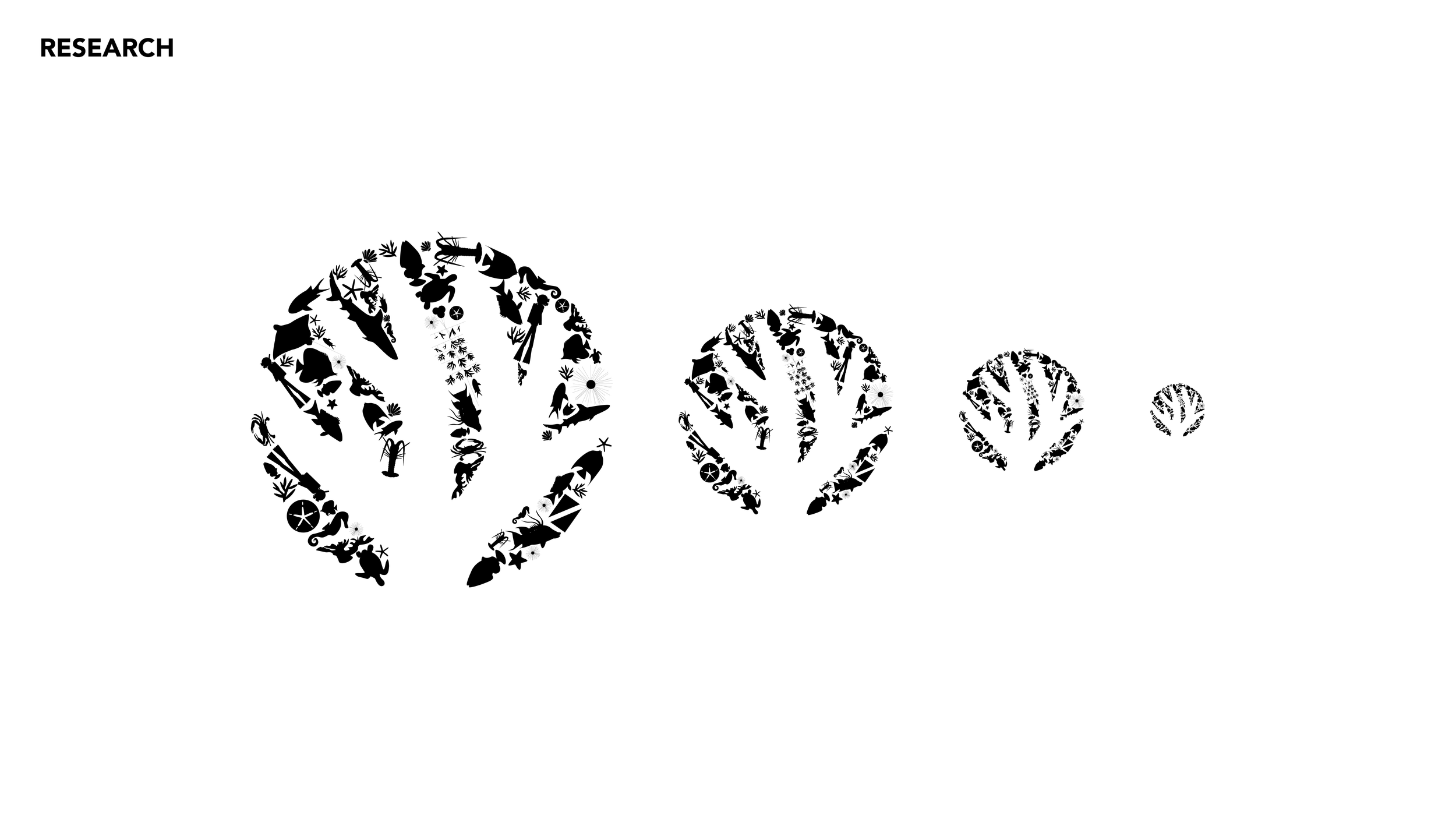
RESEARCH
To begin my ideation process I pulled various colorful designs, band posters, and music festival posters to create some mood boards. I knew I wanted to create a playful deviation of the Coral Restoration Foundation branding that still remained cohesive with the parent brand, so


DEVELOPMENT
Color is very important to the participants of Coralpalooza, and each year our team selects a "hero color" that defines all of the merch & branding. This is a tradition that they didn't want to get rid of, so I selected a myriad of colors that work well in any combination as well as on their own. These colors also work great as a gradient background, and create a playful, rainbow effect that lends to the psychedelic, festival vibe I'm trying to help cultivate. The typefaces I selected for this project are similarly playful, retro, and psychedelic.

One of the things that I needed to consider when redesigning the brand identity of Coralpalooza was maintaining the brand recognition that the event has built over the past few years. Instead of throwing out the old design, I took the concept and elevated it, creating a cleaner logo mark that is recognizable from a distance, prints consistently well on merchandise, and looks great with the refreshed typefaces.

Additionally, I needed the Coralpalooza branding to fit nicely under the Coral Restoration Foundation brand umbrella. To achieve this I used compatible color tones, and utilized a hand drawn variation on the original "Coral O" for the main component of the Coralpalooza logo. Through the design process, I slowly stripped it down until it was made up entirely of stylized fragments of Acropora coral.
IMPLEMENTATION
This design language has been used in two coralpaloozas at this point and so far it has been a huge success.